THIS POST RECORDS the color treatments for exterior walls, as proposed last summer by Roberta Tishman’s color committee, together with their consultant from Sydney Harbour Paint Company (SHP).
The committee was given two criteria to guide its efforts:
- the wall color must be as light as possible, so as to last as long as possible and need as little maintenance as possible; and
- exploration should start with the light green that was original in 1948.
 |
The committee came up not only with a main wall color as requested, but also with a variety of accent colors, arranged in three related color schemes.
The colors mentioned are standard colors in the SHP palette. Our office has one set of 8"x8" swatches of most of them.
Below the jump, I record the committee’s recommendations, for posterity, while providing links to online swatches. (The color displayed will depend upon your device.)…
Columns
All three of the schemes call for the Greek-style columns to be painted off-white with a special textured paint. In the SHP palette, it is called White Sand (stone paint coarse). The color is actually closer to that of natural marble than the bright white that we have now.

The SHP “stone paint” product contains particles of graded quartz. This is said to add to the durability and the resistance to color fading, in addition to the texturing. It has a matte finish, which hides surface imperfections.
Color Scheme #1
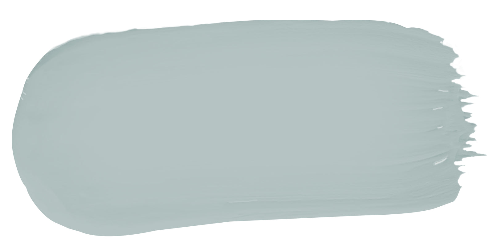
This scheme was the committee’s first choice. It is the only one that was given a descriptive name; it is labeled “Contemporary.” Basically it calls for pale greenish-blue walls, with coffee doors and window trim. The façade under the portico would be a medium-dark hue, to contrast with the light hue of the other vertical surfaces.
STUCCO: Half Hailstorm (a/k/a Hailstorm Half Strength) (eggshell)
WINDOW TRIM: Vanilla Bean (satin)
DOORS: Vanilla Bean (satin)
FRONT INTERIOR ALCOVE: Double Hailstorm (eggshell)

Color Scheme #2
This scheme and the next one seem to answer the question: “If we could do whatever we wanted with color—without needing to think about long-term costs (or historic preservation)—what would we do?” Nice to know…
Basically this one imagines a more saturated—and more greenish—wall, with reddish-brown window trim and doors that are coffee and light brown.
STUCCO: Liberty Green (eggshell)
WINDOW TRIM: Library Red (satin)
DOORS: Vanilla Bean and Icelandic Stone (satin)
FRONT INTERIOR ALCOVE: 2x/3x Liberty Green (eggshell)
Color Scheme #3
This scheme calls for a deeper blue wall, with dark blue-gray doors and window trim.
STUCCO: Breakwater (eggshell)
WINDOW TRIM: Yacht Race (satin)
DOORS: Yacht Race (satin)
FRONT INTERIOR ALCOVE: Breakwater [perhaps 50%] (eggshell)
No comments:
Post a Comment